Operational monitoring standards
- Operational monitoring is targeted for R&D and Data Quality teams, as well as for Data Stewards and Data Owners who need to:
Have a visibility on the results of routine data quality checks on the Datasets that are within their scope
Identify the ratio of records that have failed for specific controls
Extract the specific lines within Datasets that are in error to launch corrective actions
Understand trends in the state of data quality and incident management
Data Quality controls can be done on a given column within a given Dataset and/or on multiple columns within the same Dataset or across multiple Datasets. Datasets are grouped by Data Domains, for which Data Owners and Data Stewards are assigned. The results of controls on Datasets that are under their scope are made available to them as well as to the R&D Teams. At a higher level, Data Domains are grouped within Business Areas for which BDOs are assigned. The aggregated results of Data Domains are reported at the BDO level.
The following figure illustrates the structuring concepts:
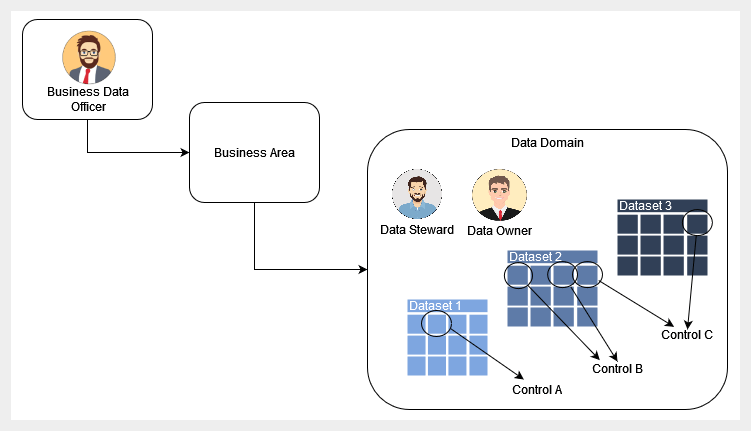
Overview of key structuring concepts
- Monitoring standards at operational level include
- In depth dashboards for Data Stewards and R&D and Data Quality teams:
- Aggregated dashboards for Data Owners:
- Standard filters are proposed on each of the dashboards with filtering on:
Organizational scopes such as BDO, Business Area, Business Domain (optional) and Data Domain,
Technical scopes such as Dataset or Control,
Ownership/responsibility scopes such as Data Owner or Data Steward.
Detailed dashboards for Data Stewards
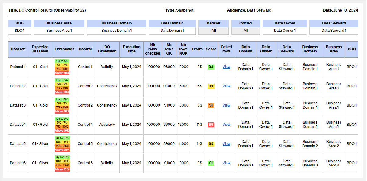
Snapshot of DQ Control Results
This dashboard helps identify the DQ controls on which there are errors: e.g. which controls have low scores, which critical data have errors.
From this report, it is possible to drill down to the list of failed rows with the “Failed Rows report”.
![]() Information: Please refer to the Key terms and abbreviation section for the definition of terms used in the dashboards. Please note that figures provided in the dashboard are illustrative examples. For more details about calculating the overall score.
Information: Please refer to the Key terms and abbreviation section for the definition of terms used in the dashboards. Please note that figures provided in the dashboard are illustrative examples. For more details about calculating the overall score.
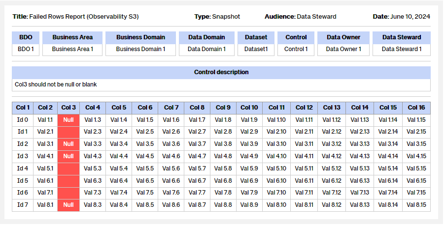
Snapshot of Failed Rows Report
This report provides the list of rows provided by a DQ control that needs immediate corrective actions and/or sustainable fixes.
The descriptive data of the DQ Control are: the database, the table, the column, the row count of the table, the error count of the control and the criticality.
This data must be analyzed to be integrated as incidents into remediation workflows.
![]() Information: Please refer to the Key terms and abbreviation section for the definition of terms used in the dashboards. Please note that figures provided in the dashboard are illustrative examples. For more details about calculating the overall score.
Information: Please refer to the Key terms and abbreviation section for the definition of terms used in the dashboards. Please note that figures provided in the dashboard are illustrative examples. For more details about calculating the overall score.
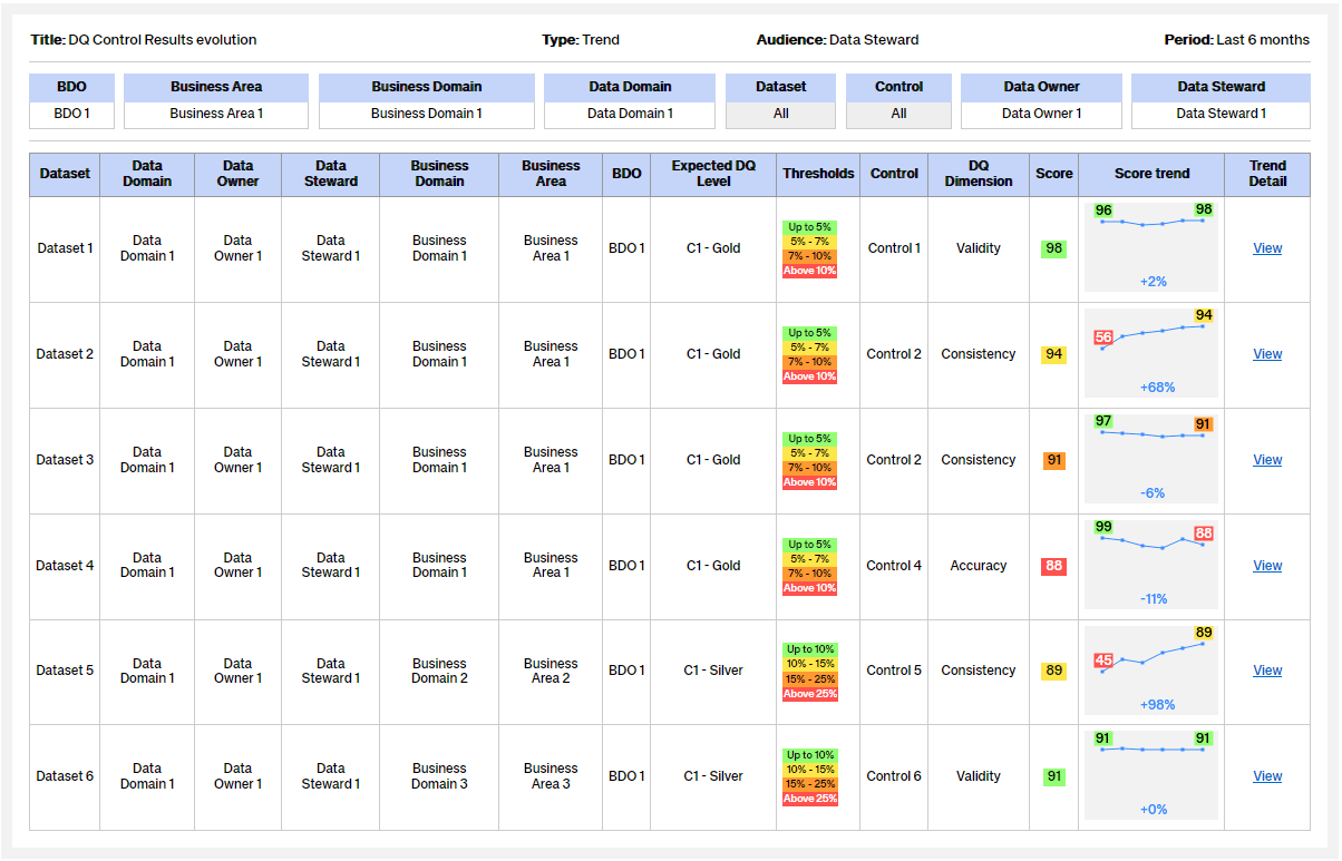
Trend of DQ Control Results
This dashboard helps identify areas where progress is being made and/or identify challenges: e.g. which controls and data are improving.
Knowledge of the evolution of the score over time provides context for the analysis of errors and their future ingestion within remediation workflows.
From this report, it is possible to drill down to the list of failed data with the “Failed data report”.
![]() Information: Please refer to the Key terms and abbreviation section for the definition of terms used in the dashboards. Please note that figures provided in the dashboard are illustrative examples. For more details about calculating the overall score.
Information: Please refer to the Key terms and abbreviation section for the definition of terms used in the dashboards. Please note that figures provided in the dashboard are illustrative examples. For more details about calculating the overall score.
Snapshot of DQ Control Status
This dashboard allows you to monitor the quality of data control by control. The filter by status and sorting by severity allows you to prioritize the analysis of issues by the R&D Team or Data Stewards
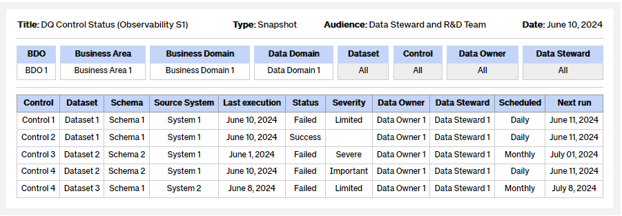
![]() Information: Please refer to the Key terms and abbreviation section for the definition of terms used in the dashboards. Please note that figures provided in the dashboard are illustrative examples. For more details about calculating the overall score.
Information: Please refer to the Key terms and abbreviation section for the definition of terms used in the dashboards. Please note that figures provided in the dashboard are illustrative examples. For more details about calculating the overall score.
Aggregated dashboards for Data Owners
Snapshot of DQ Status
This dashboard allows visualizing the state of data quality within a given scope: Business Area, Business Domain or Data Domain.
The aggregated data are the DQ Score by DQ dimension, Datasets number by criticality, Controls number by criticality and Incidents number by criticality.
It is principally designed for Data Owner use.
From this dashboard, it is possible to drill down to a more detailed view with the “DQ Control Results report”
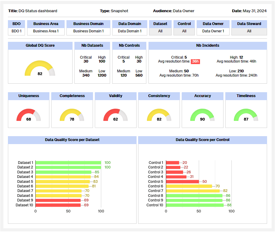
![]() Information: Please refer to the Key terms and abbreviation section for the definition of terms used in the dashboards. Please note that figures provided in the dashboard are illustrative examples. For more details about calculating the overall score.
Information: Please refer to the Key terms and abbreviation section for the definition of terms used in the dashboards. Please note that figures provided in the dashboard are illustrative examples. For more details about calculating the overall score.
Trend of DQ Status
This dashboard helps understand the trends of data quality - per DQ dimension, per dataset or per control.
This dashboard is principally designed for Data Owner use.
From this dashboard, it is possible to drill down to a more detailed view on a given scope with the “DQ Control Results evolution”
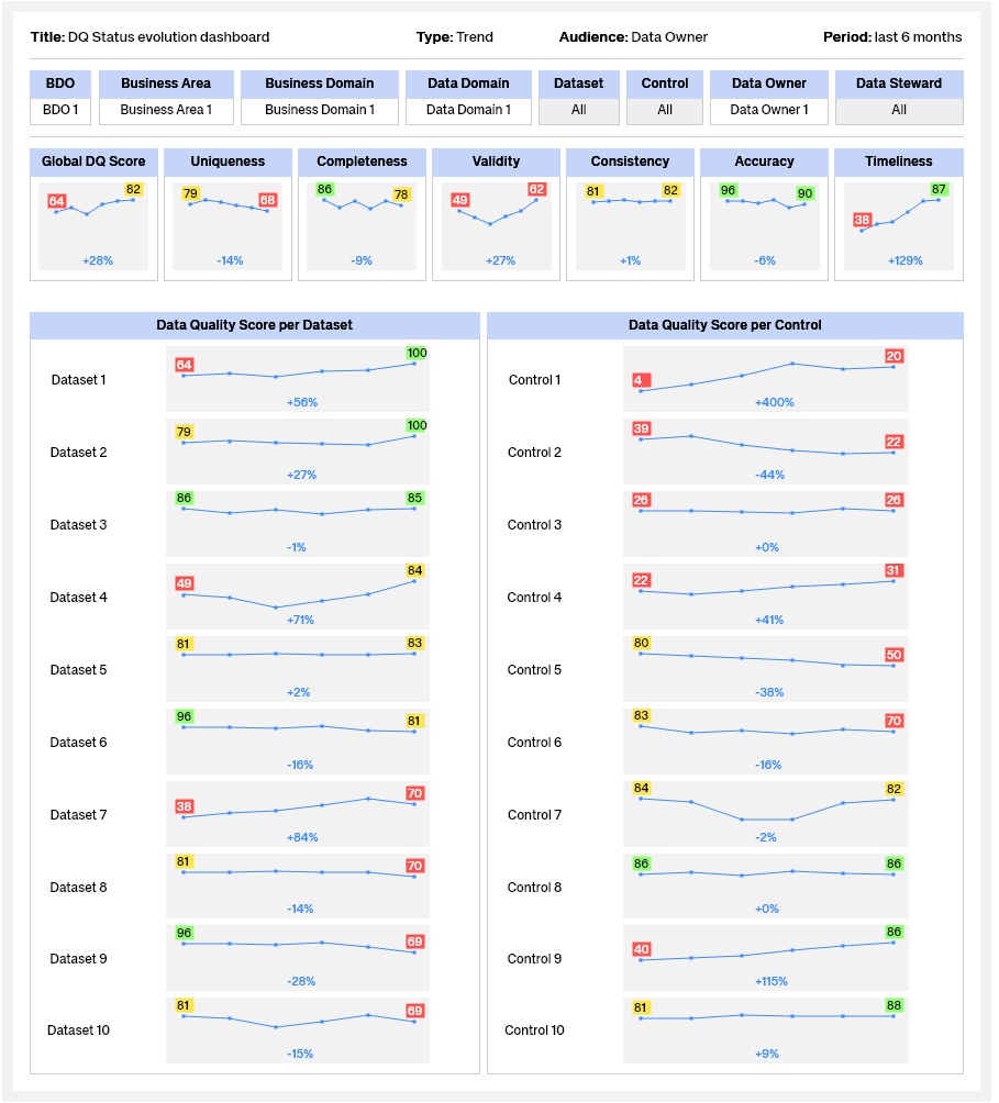
![]() Information: Please refer to the Key terms and abbreviation section for the definition of terms used in the dashboards. Please note that figures provided in the dashboard are illustrative examples. For more details about calculating the overall score.
Information: Please refer to the Key terms and abbreviation section for the definition of terms used in the dashboards. Please note that figures provided in the dashboard are illustrative examples. For more details about calculating the overall score.
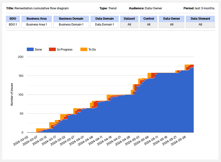
Cumulative Flow diagram
The following dashboard shows the statuses of issues over time. This helps identify potential bottlenecks that need to be investigated.
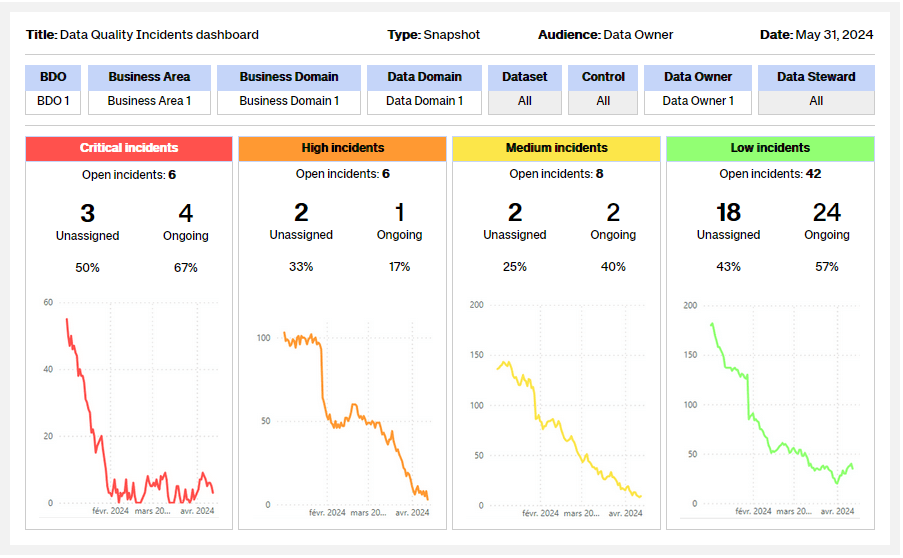
Data quality incidents dashboard
The following dashboard is a template proposed to present the state of Incidents per Data Domain. It contains:
Snapshot view on Incidents classified with a criticality level ranging from Critical to Low, containing the number of open incidents dispatched as “Unassigned” and “Ongoing”
Trends view on Incidents classified with a criticality level ranging from Critical to Low
![]() Information: Please refer to the Key terms and abbreviation section for the definition of terms used in the dashboards. Please note that figures provided in the dashboard are illustrative examples. For more details about calculating the overall score.
Information: Please refer to the Key terms and abbreviation section for the definition of terms used in the dashboards. Please note that figures provided in the dashboard are illustrative examples. For more details about calculating the overall score.
The dashboard enables effective tracking of data quality incidents, helping to quickly identify unresolved issues and prioritize resolution efforts.
Information on unassigned and in-progress incidents provides valuable insights into resource management and task allocation within resolution teams.
Trend charts provide insights into the effectiveness of actions taken to resolve data quality incidents, allowing you to adjust strategies as needed.